Fonts, Ranked — Designers, Assemble
Ranked by how much of the world each typeface was put in charge of. Design quality doesn't come into it. Vote the order into something you can defend. Yes, these are typefaces; a font is the file and the typeface is the design. The title keeps the word people search for. The rule: take the biggest job the typeface's own Wikipedia article documents, then sort by who handed that job out. A country or a platform first, meaning national road signs, a transit network, a face bundled with an operating system. Then a single organisation that put it on everything it made. Then the ones nobody put in charge, which a trade picked up. Inside each band the earliest start date leads, and every description names the year that put it there and says where that year came from when the article doesn't spell it out. Ties go to the alphabetically earlier article title. Three kinds of thing are compared here on purpose — single designs, families, and Caslon and Didot, which are naming traditions spanning centuries and many hands.
Johnston is #1 on “Fonts, Ranked — Designers, Assemble”.
- 1
Johnston
Frank Pick put Edward Johnston to work on it in 1913 for the Underground Electric Railways Company of London, and the article dates the lettering's introduction to 1916. London's public transport has carried it as its corporate face ever since the Passenger Transport Board formed in 1933, and Transport for London still allows nothing else — the roundel on a platform wall is running a 1916 decision.
 Johnston (typeface) - Wikipediahttps://en.wikipedia.org/wiki/Johnston_(typeface)
 - 2

Highway Gothic
Its real name is the Standard Alphabets For Traffic Control Devices, and the US Federal Highway Administration published them in 1948. Every green overhead sign on an American freeway is set in it. The article says the font is used for road signage in the United States and many other countries worldwide, and Canada and Australia are both named. Seventy-eight years on one job.
 Highway Gothic - Wikipediahttps://en.wikipedia.org/wiki/Highway_Gothic
 - 3
Transport
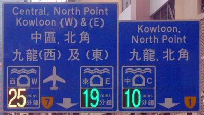
Between 1957 and 1963, Jock Kinneir and Margaret Calvert drew it for the Anderson and Worboys committees. It went up first on the Preston bypass in 1958, then on the M1 a year later, and it has stayed on British road signs ever since — Ireland and Portugal are among the countries that took it too.
 Transport (typeface) - Wikipediahttps://en.wikipedia.org/wiki/Transport_(typeface)
 - 4

Helvetica
New York's Metropolitan Transportation Authority adopted it for signage in 1989, and that is the biggest dated job the article records — the Canadian government's use of it as an identifying typeface carries no year at all. Max Miedinger and Eduard Hoffmann developed it in 1957 under the name Neue Haas Grotesk. Washington Metro and Madrid Metro run it, and US federal income tax forms are set in it.
 Helvetica - Wikipediahttps://en.wikipedia.org/wiki/Helvetica
 - 5

Arial
Every version of Windows after 3.1 has shipped with it. In 1992 Microsoft chose it as one of the four core TrueType families for that release, announcing it as an alternative to Helvetica, and it was the default font. The selling point was arithmetic — it is metrically compatible with Helvetica, so a document can swap one for the other without the visual layout moving.
 Arial - Wikipediahttps://en.wikipedia.org/wiki/Arial
 - 6
Times New Roman
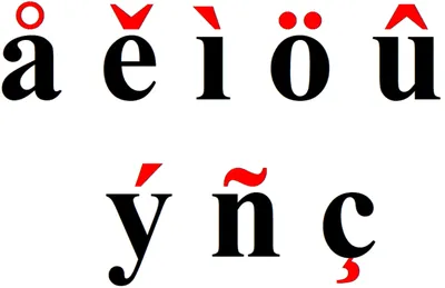
Commissioned by the British newspaper in 1931 after Stanley Morison pushed for a change of body text, the design made its debut in The Times on 3 October 1932, and the paper stayed with the original for 40 years. Its own article says every Windows release since 3.1 includes it but gives no year — the 1992 date, and the list of four fonts shipped with Windows 3.1, sit in Arial's article one rank up.
 Times New Roman - Wikipediahttps://en.wikipedia.org/wiki/Times_New_Roman
 - 7
Verdana
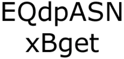
Microsoft had Matthew Carter draw it, with hand-hinting by Thomas Rickner, and released it in 1996 bundled with subsequent versions of Windows, Office and Internet Explorer — the brief was legibility at small sizes on the bad screens of the day. In 2009 IKEA changed the typeface in its catalog from Futura to Verdana, wanting one face for print and web.
 Verdana - Wikipediahttps://en.wikipedia.org/wiki/Verdana
 - 8
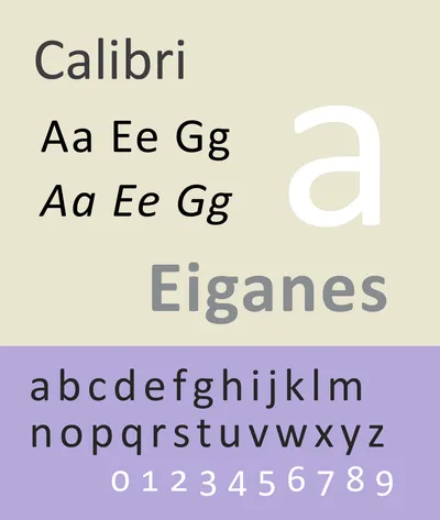
Calibri
Word's default from Office 2007 onwards, it pushed Times New Roman out of that seat and kept it until January 2024, when Microsoft swapped in its own Aptos — seventeen years, by the article's own count. Anything typed in those years without a decision about type is set in it: every memo, every dissertation draft.
 Calibri - Wikipediahttps://en.wikipedia.org/wiki/Calibri
 - 9
Avenir
Twenty-five years after Adrian Frutiger drew it in 1987, it arrived where most people would actually meet it. From 2012 onwards it was bundled with iOS and macOS as a system font, starting with the Mountain Lion release. Amsterdam uses it as the principal typeface in the city's visual identity — the article gives no year for that one, so it decides nothing here.
 Avenir (typeface) - Wikipediahttps://en.wikipedia.org/wiki/Avenir_(typeface)
 - 10
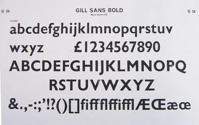
Gill Sans
Eric Gill designed it and Monotype's British branch released it in 1928. In 1929 the London and North Eastern Railway put it on every poster, timetable and scrap of publicity it produced, and after the 1948 nationalisation British Railways built its standard lettering on it — Penguin put it on those flat modernist paperback covers too.
 Gill Sans - Wikipediahttps://en.wikipedia.org/wiki/Gill_Sans
 - 11
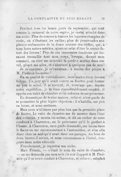
Didot
Named after the French family of printers, punch-cutters and publishers, this is a group of typefaces rather than one design — which is exactly why ranking it against a dated commission is awkward. Vogue had used it on covers on and off from the 1940s, and in 1955 it became permanent there. Zara built a heavily-kerned logo out of it in 2019.
 Didot (typeface) - Wikipediahttps://en.wikipedia.org/wiki/Didot_(typeface)
 - 12
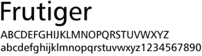
Frutiger
The newly built Charles de Gaulle Airport wanted a directional sign system for a terminal nobody had walked through yet. The Roissy typeface was completed in 1972 and later became the retail release named for its Swiss designer, Adrian Frutiger. It is a series of typefaces rather than a single face, which matters when it is being ranked against one commission.
 Frutiger (typeface) - Wikipediahttps://en.wikipedia.org/wiki/Frutiger_(typeface)
 - 13
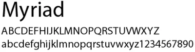
Myriad
Robert Slimbach and Carol Twombly drew it for Adobe Systems. From the launch of the eMac in 2002 it replaced Apple Garamond as Apple's corporate font, and beginning in 2015 the Apple-designed San Francisco replaced it — thirteen years across every keynote slide and product box. The Order of St John took Myriad Regular and Bold for its logo in 2005.
 Myriad (typeface) - Wikipediahttps://en.wikipedia.org/wiki/Myriad_(typeface)
 - 14
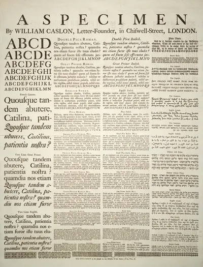
Caslon
Nobody commissioned this one. It is the name given to serif typefaces designed by William Caslon I in London from 1725, or inspired by his work — a naming tradition rather than a single artefact. Caslon types were distributed throughout the British Empire, including British North America, where they were used on the printing of the U.S. Declaration of Independence. Adobe Caslon sets The New Yorker's body text.
 Caslon - Wikipediahttps://en.wikipedia.org/wiki/Caslon
 - 15
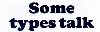
Cooper Black
An ultrabold display serif from 1922, designed by Oswald Bruce Cooper and released by the Barnhart Brothers & Spindler foundry. Its advertising work declined in the 1960s, then the cover art for the 1966 Beach Boys album Pet Sounds put it back in front of everyone, and record sleeves have reached for it ever since. No client ever put it in charge of anything.
 Cooper Black - Wikipediahttps://en.wikipedia.org/wiki/Cooper_Black
How this list was ranked
Readers rank this list by voting items up and down. Items are ordered by reader votes.
0 comments
Related lists
Best Restaurants in Des Moines (2026)
Other · Curated
The Scariest Movie Villains of All Time
Other
The Best Super Bowl Halftime Shows Ever
Other
The Best Word Games, from the Crossword to Wordle
Other

The Urban Legends That Changed Something Real
Other
The Best Unsolved Mysteries That Keep People Up at Night
Other